River & Sky
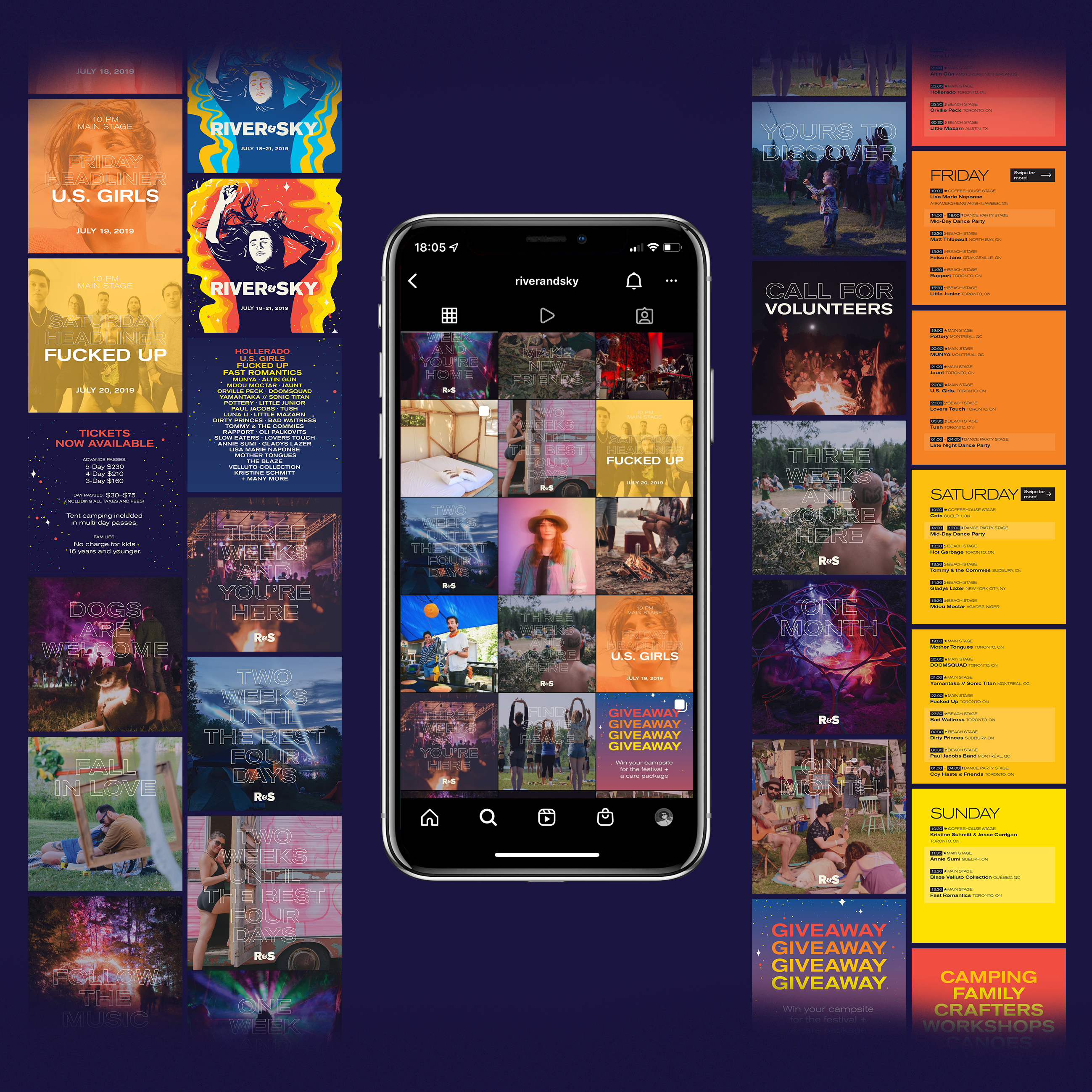
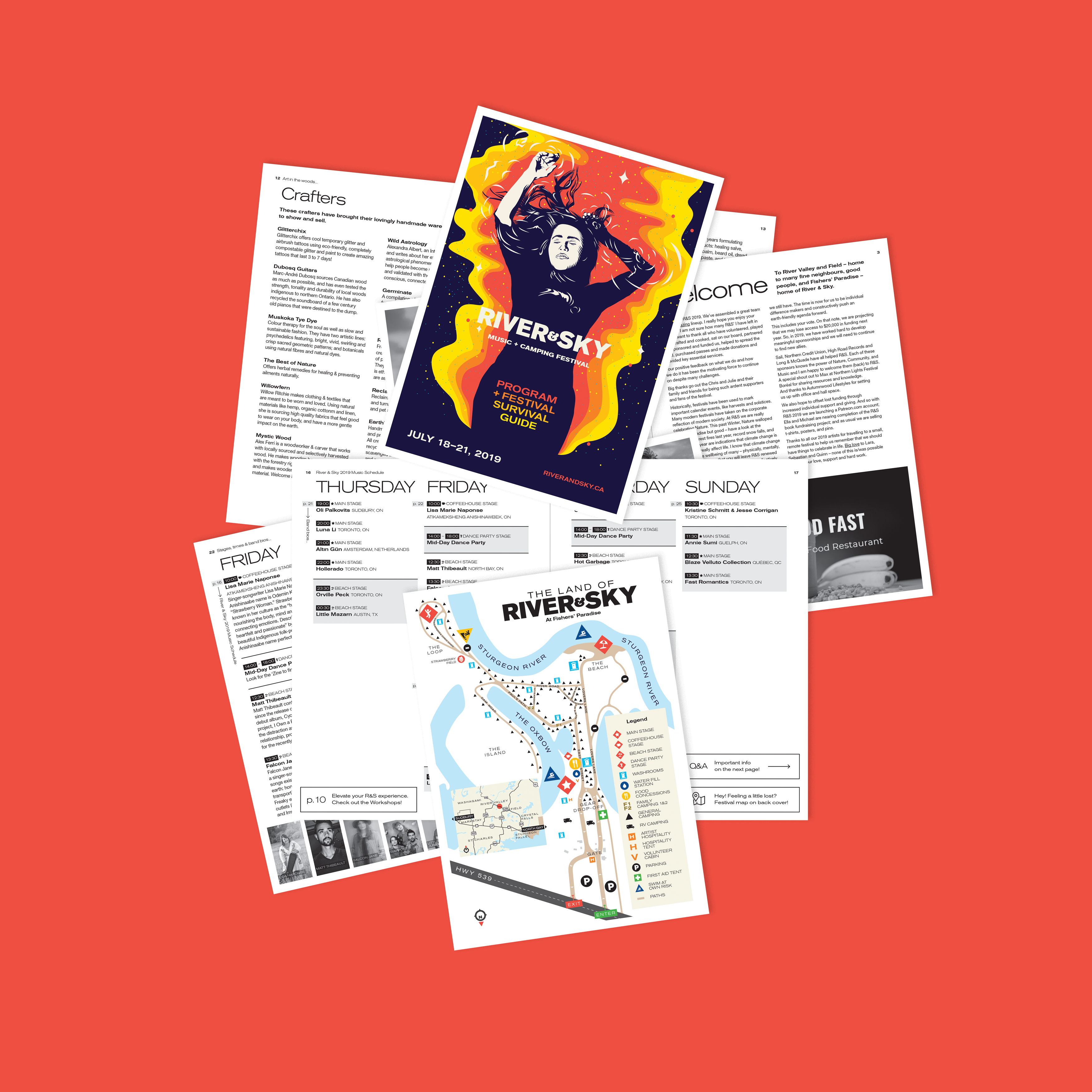
From 2019–2022, I worked with River & Sky in Sudbury as lead designer across the festival’s evolving visual identity, annual campaigns, digital communications, advertising, merchandise and environmental applications.
Each year brought a new program, new artists and new stories to communicate, while the festival itself needs to remain recognizable from one season to the next.
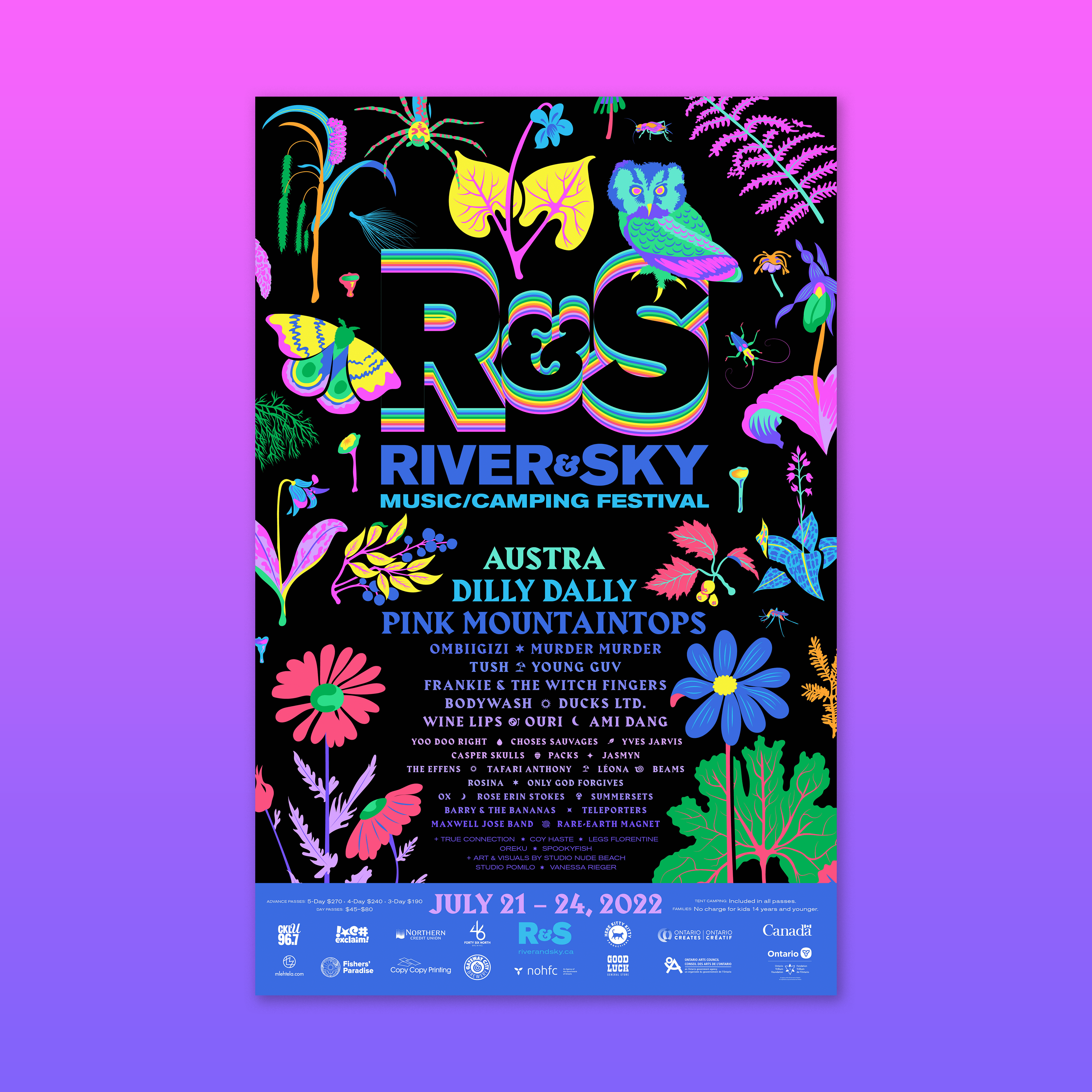
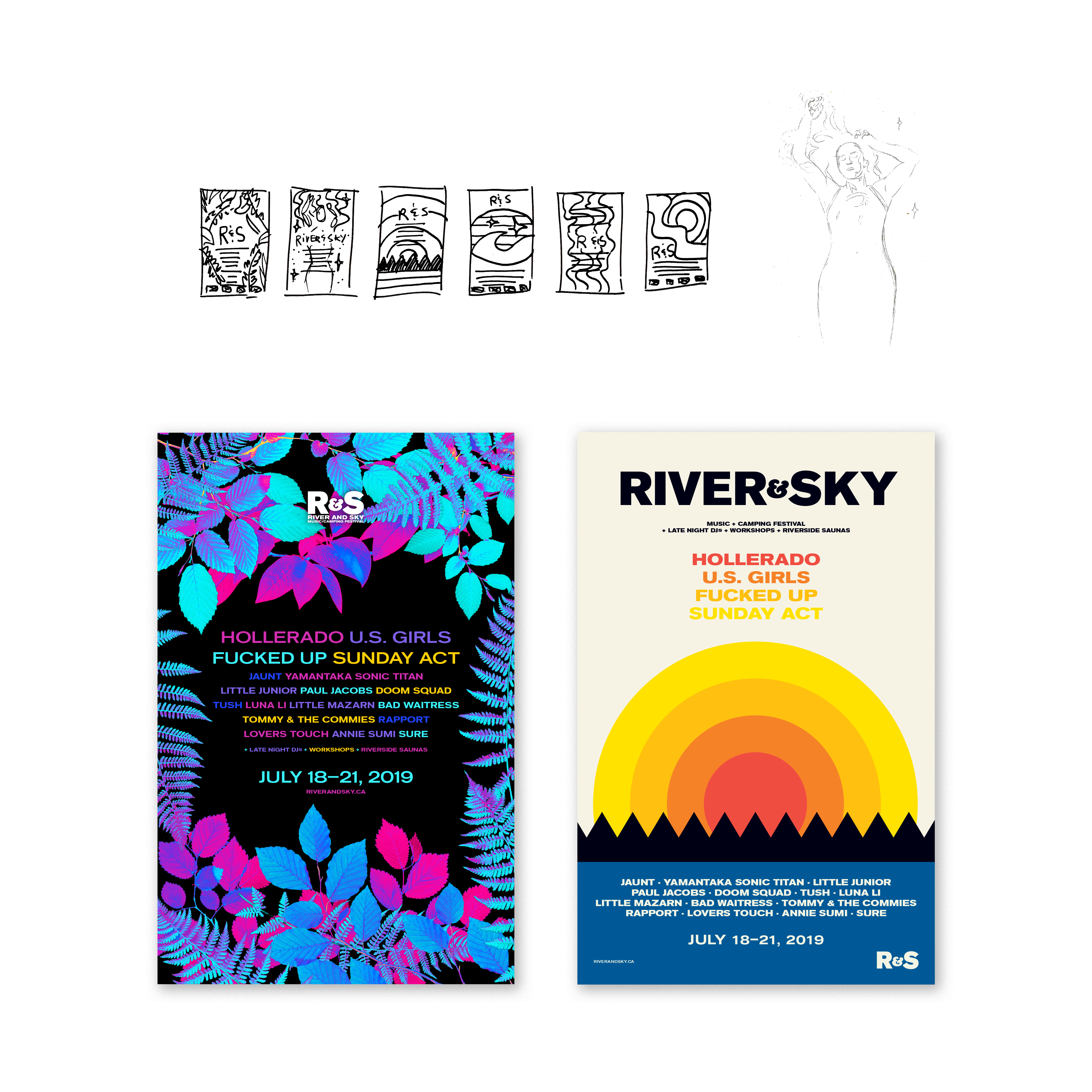
The result is an identity that is intentionally designed to evolve rather than remain static—using illustration, colour, typography and composition to give each year’s festival its own character while maintaining a recognizable connection to the larger River & Sky identity.
Client
River & Sky Music and Camping Festival
Disciplines
Branding & Identity, Illustration
Exploration
River & Sky needed a visual identity that could change dramatically from year to year without losing recognition.
The festival’s programming spans music, visual art, performance and community events, creating a wide range of stories and personalities to communicate. A rigid identity system would quickly become repetitive, while an entirely new visual identity every year would make it difficult to build recognition.
The challenge was to find the space between the two—a flexible visual system capable of changing its personality while retaining a recognizable core.
Denouement – The Untangling
Illustration became one of the primary tools for creating that flexibility. Each festival begins with a new visual idea that responds to its programming, atmosphere and location. Illustrations can become posters, advertisements, social graphics, merchandise and environmental elements, allowing a single concept to move across the festival’s communications.
Typography and layout provide continuity between years, while the illustration and colour palette provide the opportunity for each season to develop its own personality.
The system therefore behaves less like a traditional fixed identity and more like a visual framework—one that is designed to change.
2020 Festival
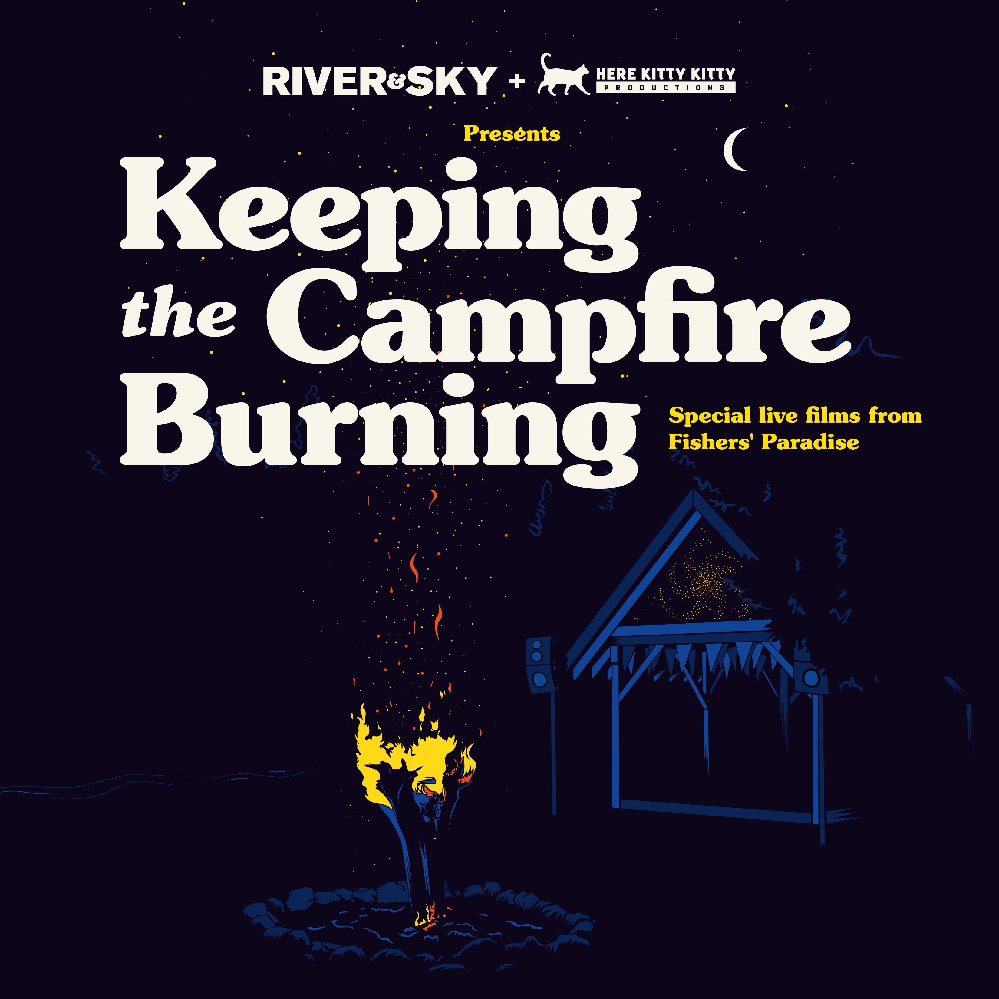
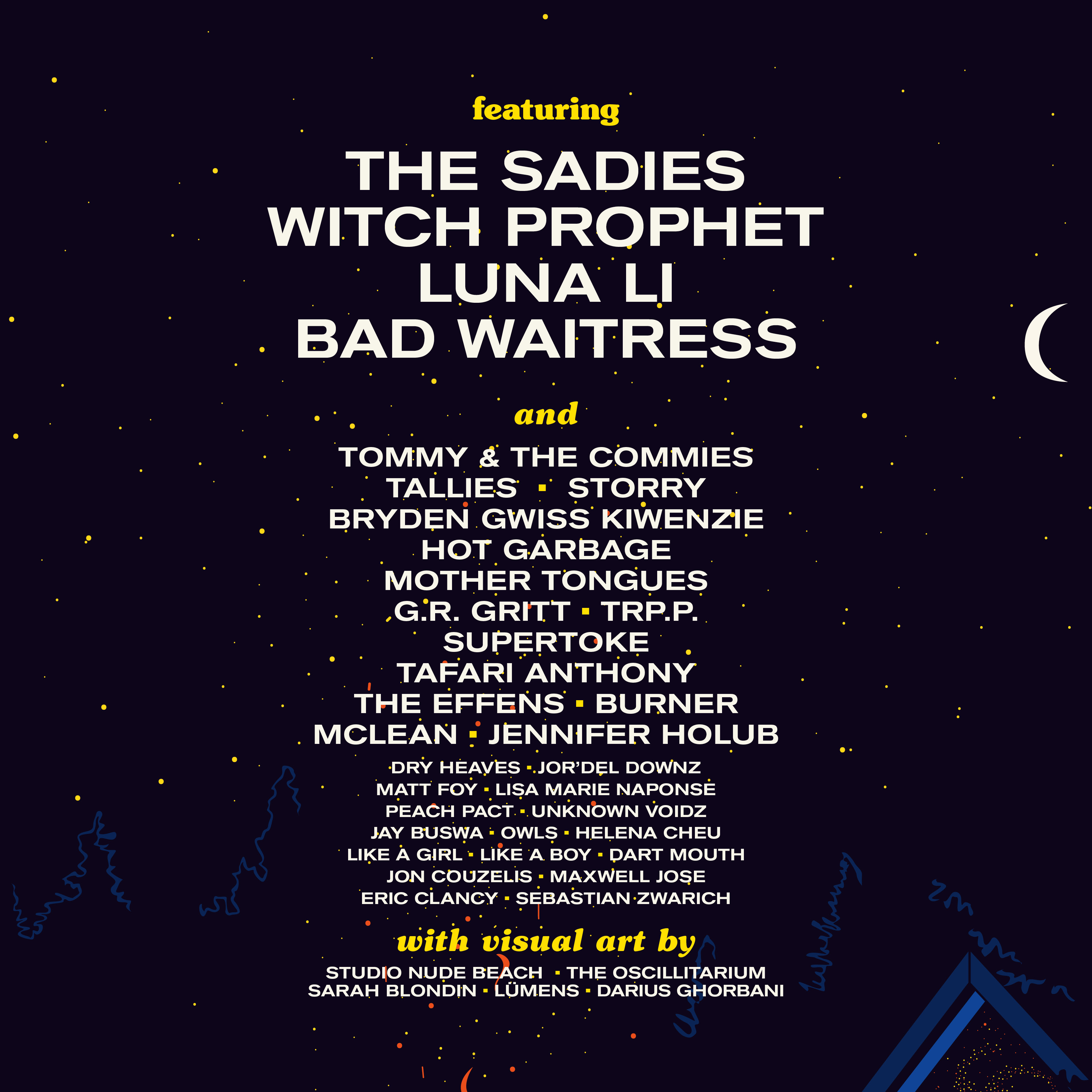
With no audience except for a few lucky campers and staff running the production, the festival went on in a different format in 2020 — a series of live videos recorded over a 1 month period at Fishers’ Paradise, and released online throughout the year. I illustrated a poster depicting the empty Beach Stage – the secret favourite stage of most attendees – longing for its audience. I created a poster and social media graphics that were used to promote the series of videos.
2021 Festival
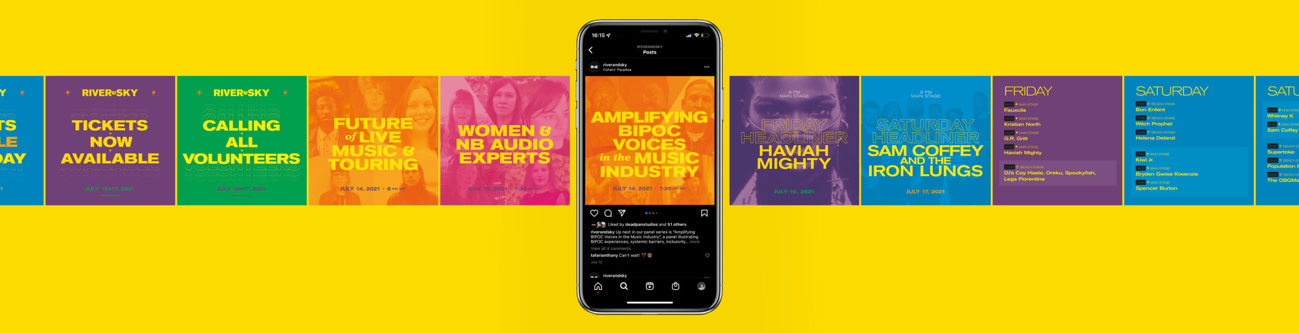
In 2021, the festival went on with a reduced capacity due to the ongoing pandemic, but returned to an in-person format. I worked with a fellow illustrator, Sonia Ekiyor-Katimi, who created the main image. I designed the poster, social media promos and the program to compliment and feature the artwork by the artist.
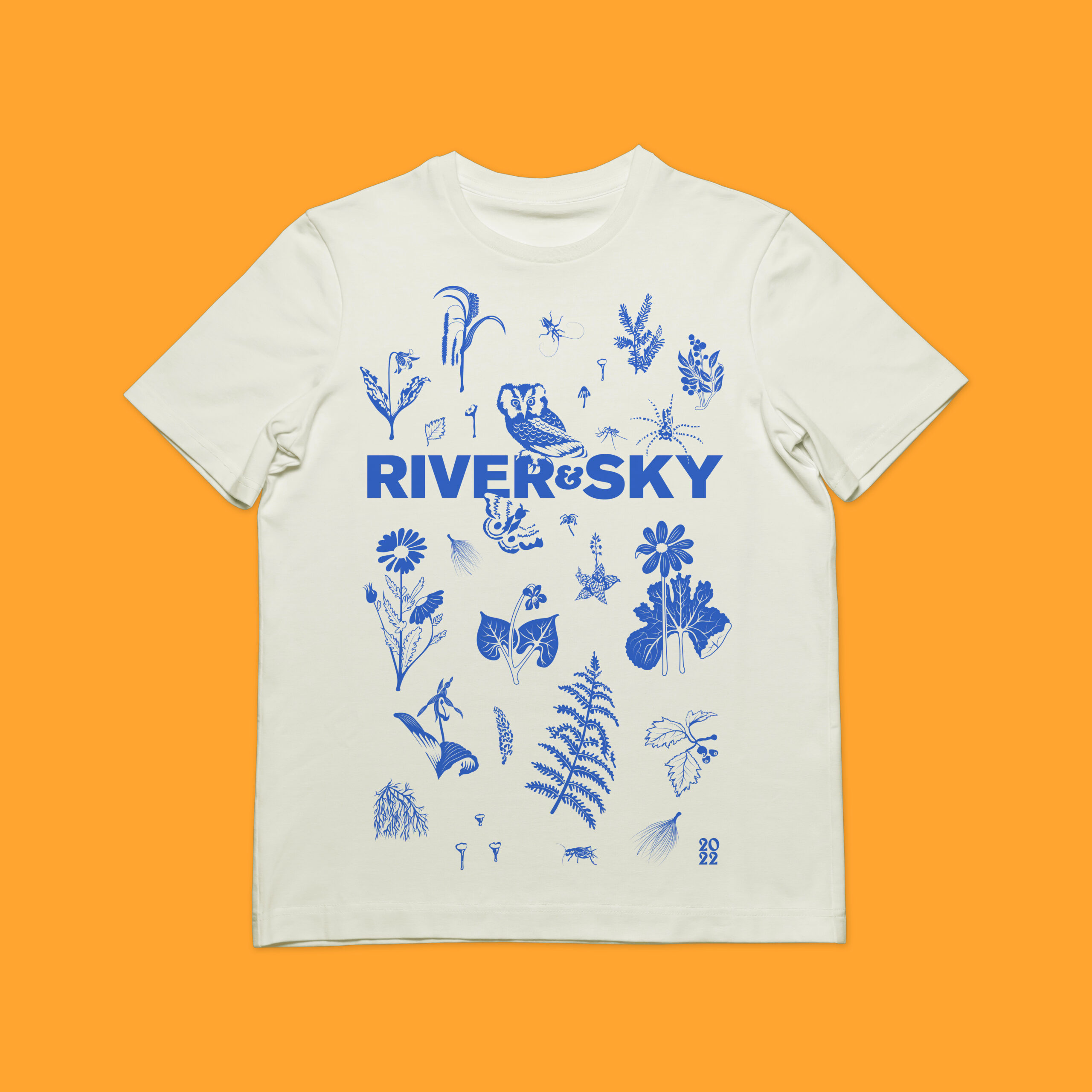
2022 Festival
Since 2019, I’ve had the pleasure of creating the poster and design for R&S, and in 2022 I was able to finally create a concept that I have been thinking of since the beginning. I illustrated local flora and fauna you may find lurking in the woods at the venue at Fishers’ Paradise in Field, Ontario along the Sturgeon River to create a poster, program, social media content and merchandise including a t-shirt and bandana. I used my favourite palette – technicolour.