Main Supply
The Farm in North Bay, Ontario needed a sub brand called Main Supply Goods & Refillery. The business provides a convenient way to reduce single-use plastics in everyday life. Rather than purchasing a new container each time you need more shampoo, conditioner, soap, lotion, all-purpose cleaner, etc., you simply refill extended-use containers with those products.
I was commissioned, based on my previous work with River & Sky Music and Camping Festival, to create a logotype, social media posts, and stationery to launch a new retail space.
Client
Main Supply Goods & Refillery
Disciplines
Branding & Identity, Illustration
Exploration
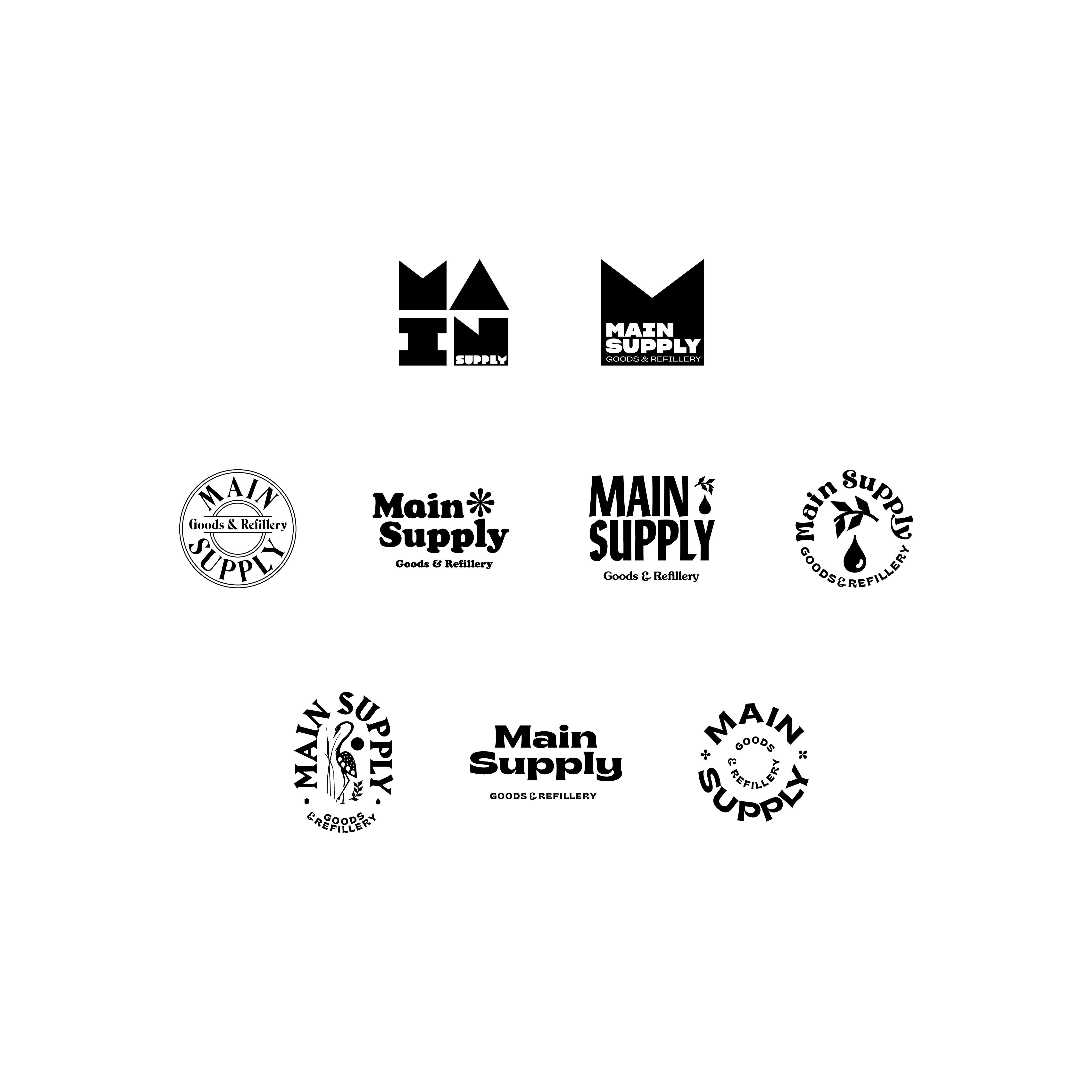
I worked with the client on many iterations to create a logotype and brand that spoke to the conscious consumer, looking for ethically sourced goods for their home. The main challenge with this project was working with the client’s shifting directions, but in the end it led to a better, more informed final product. Here is some of the process work that led to the final product.
Denouement – The Untagnling
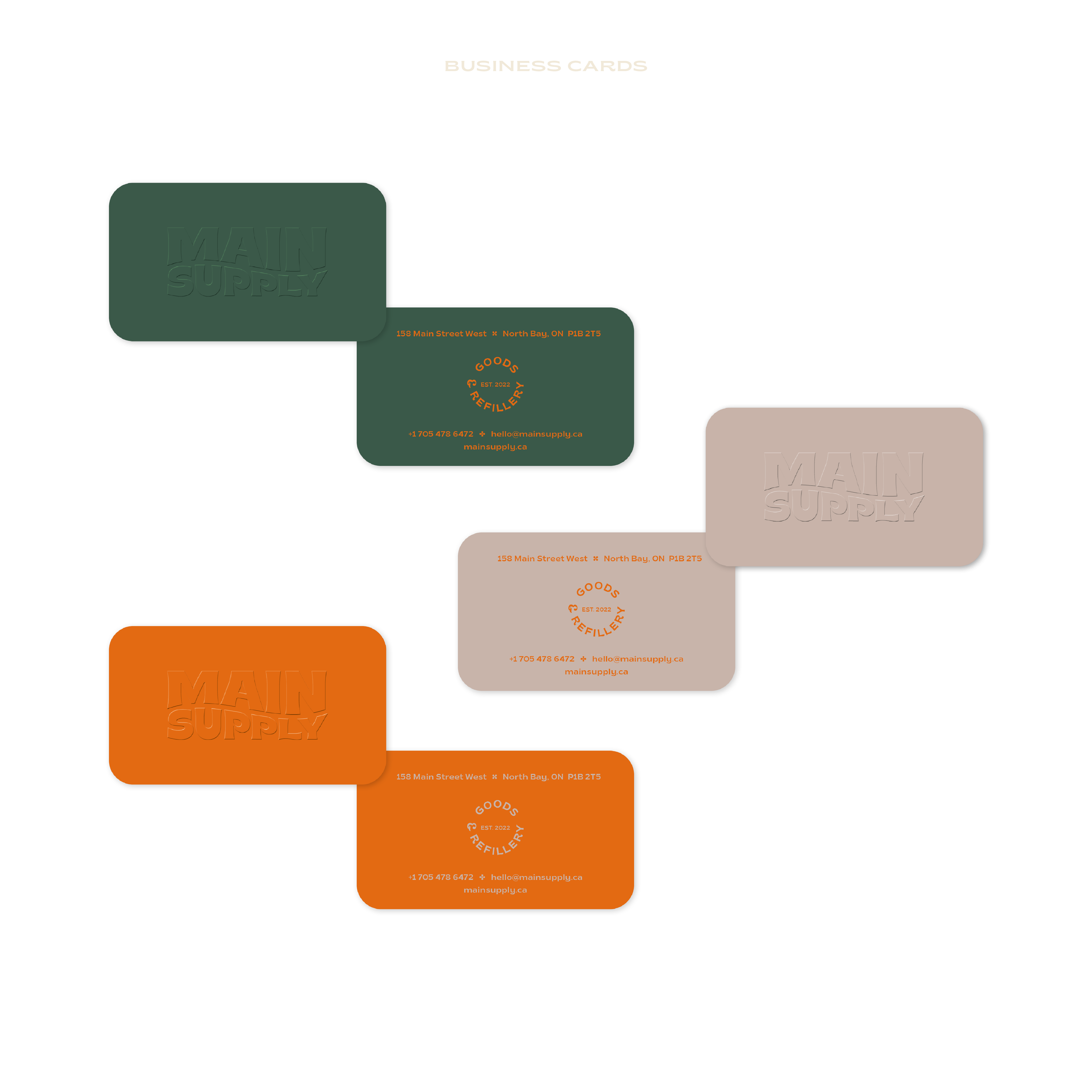
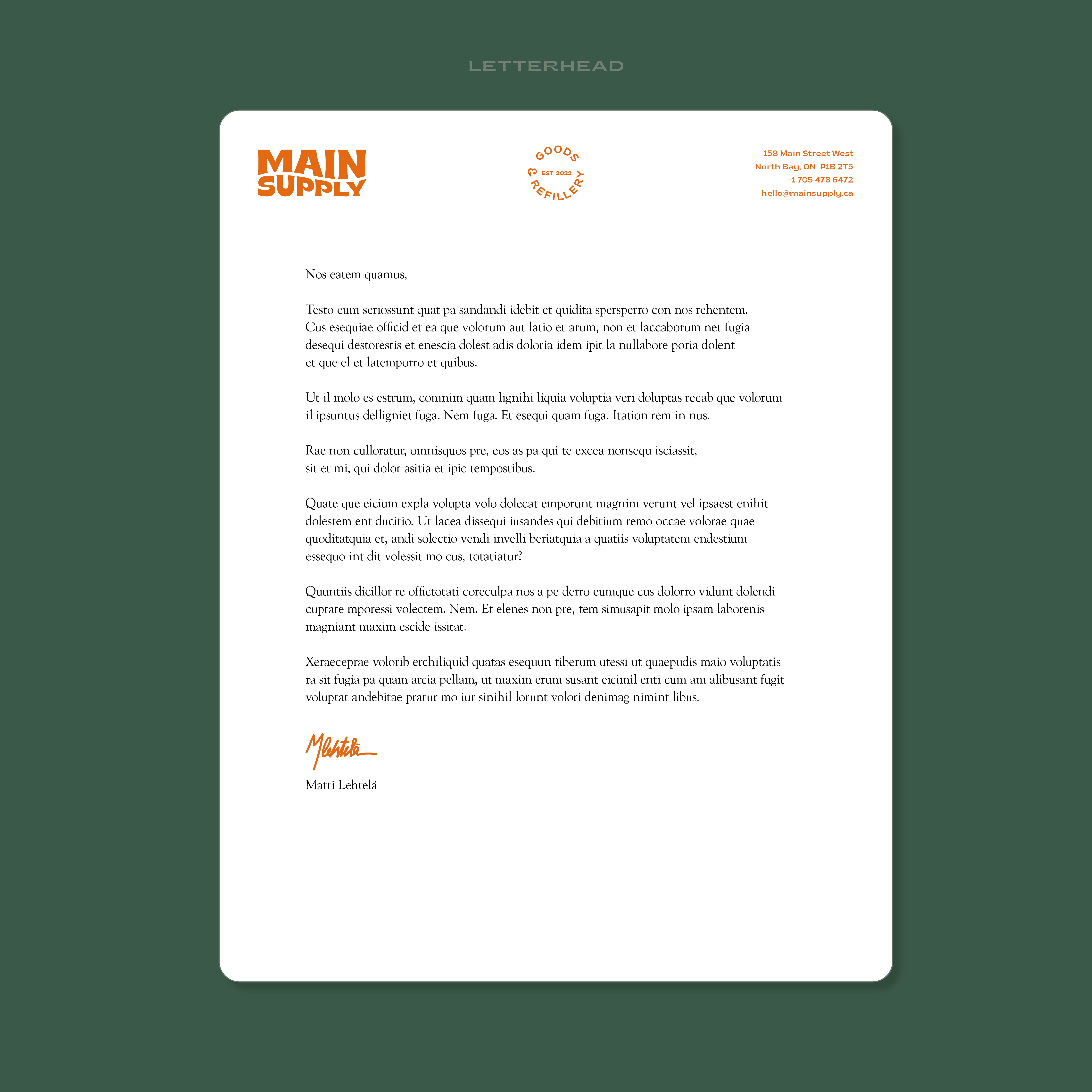
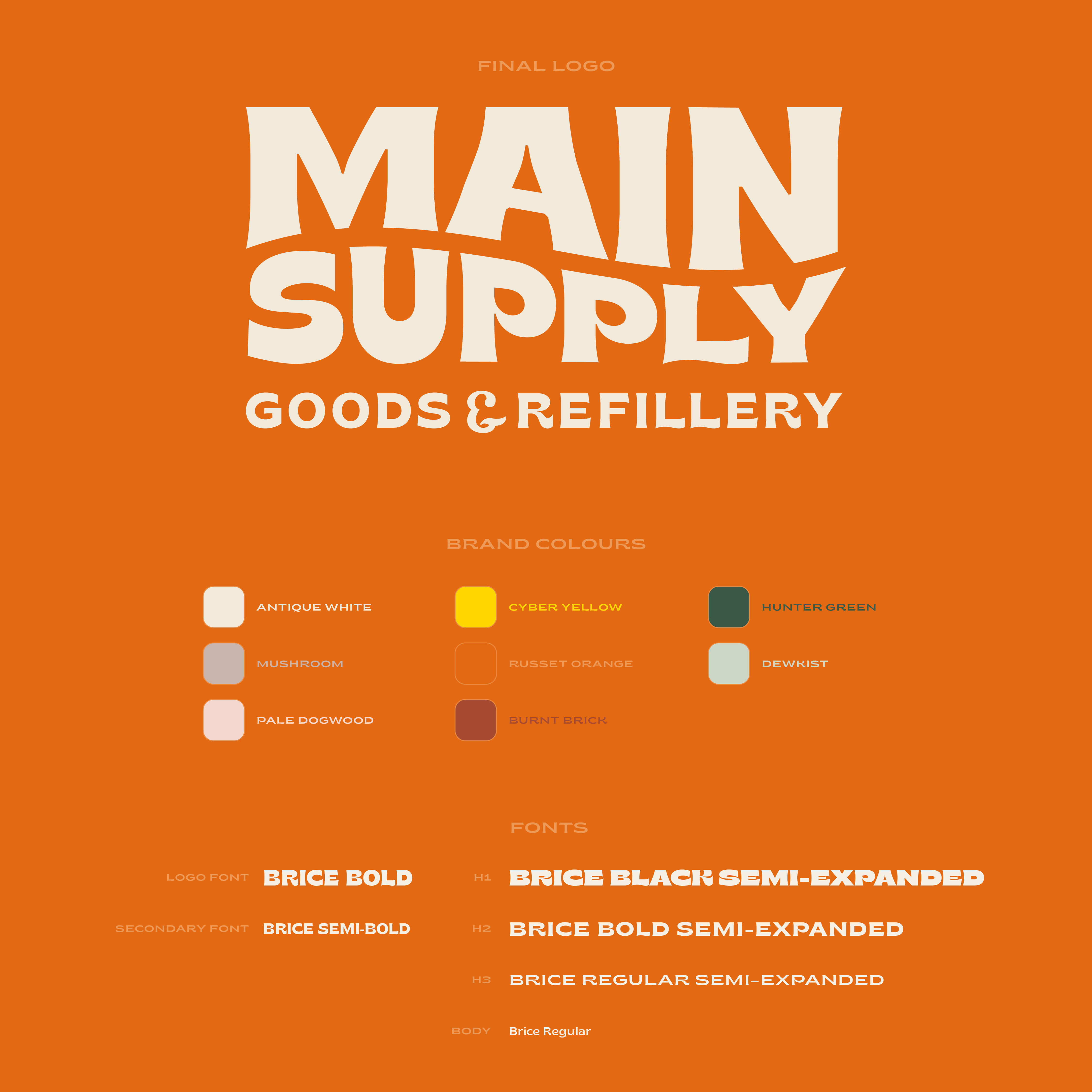
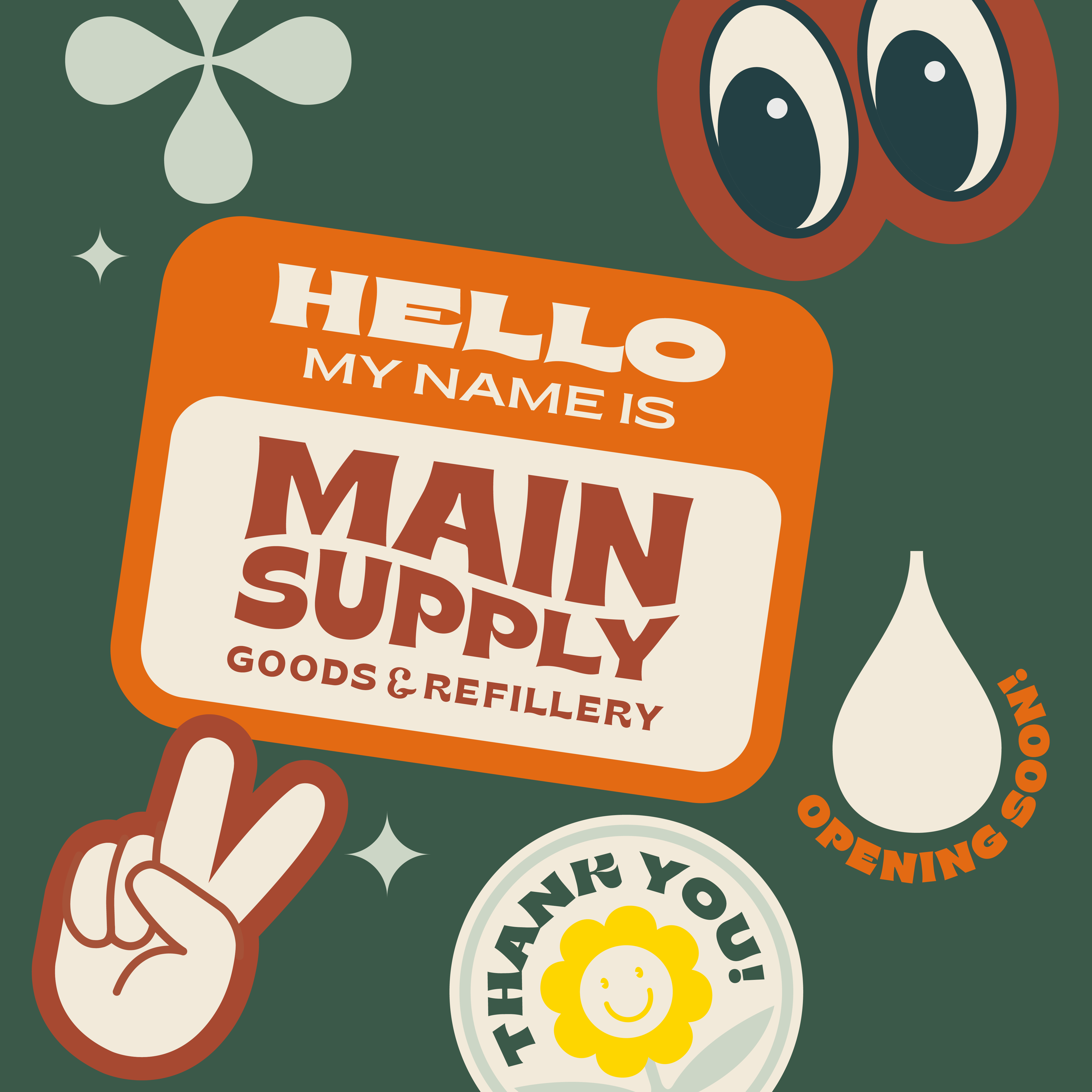
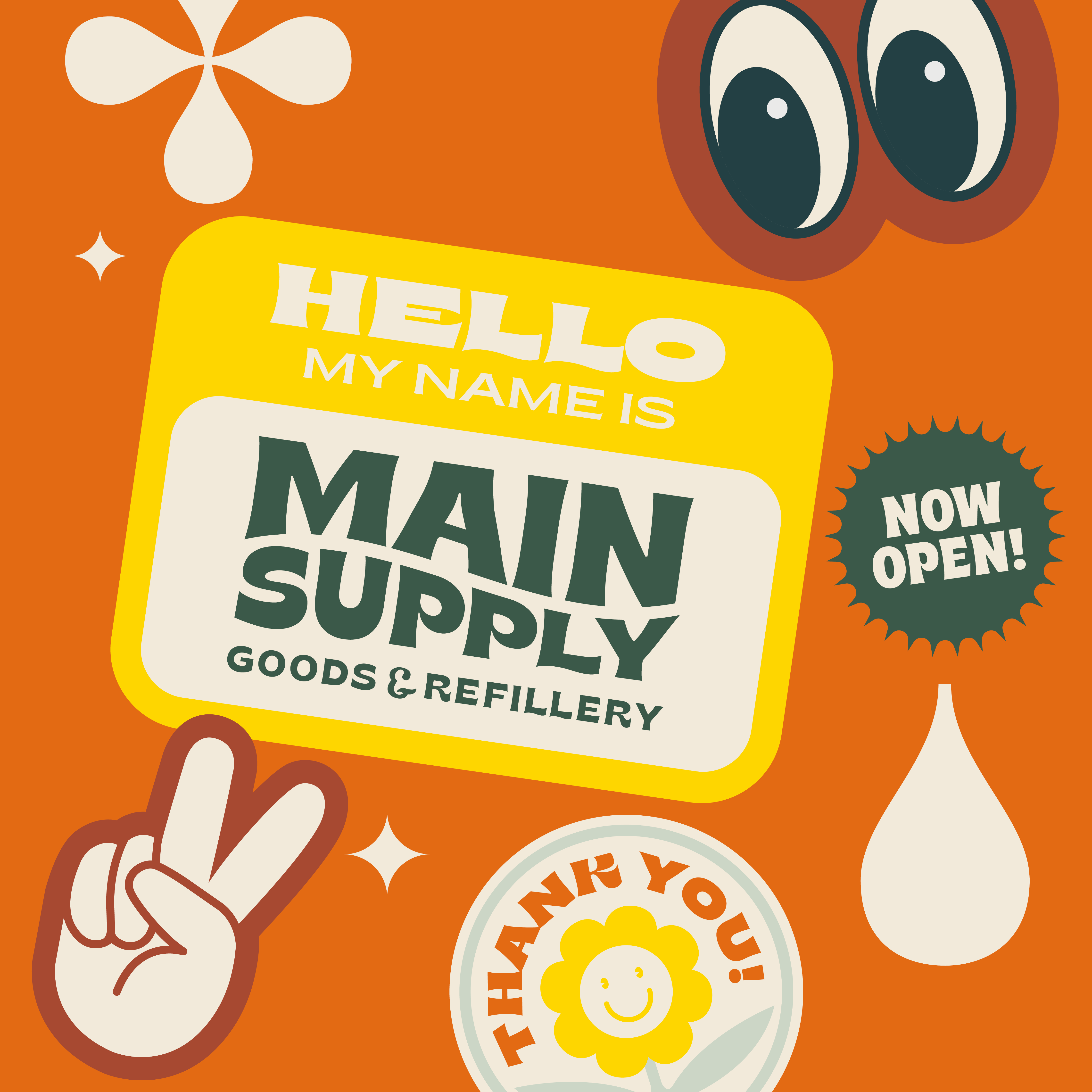
The final logo pulls influences from classic apothecary nostalgia combined with a modern sensibility to create an identity that feels both anchored in the past and explicitly contemporary. I also created a suite of graphics to compliment the logotype to introduce the brand via social media and the physical storefront on Main Street in North Bay, Ontario.
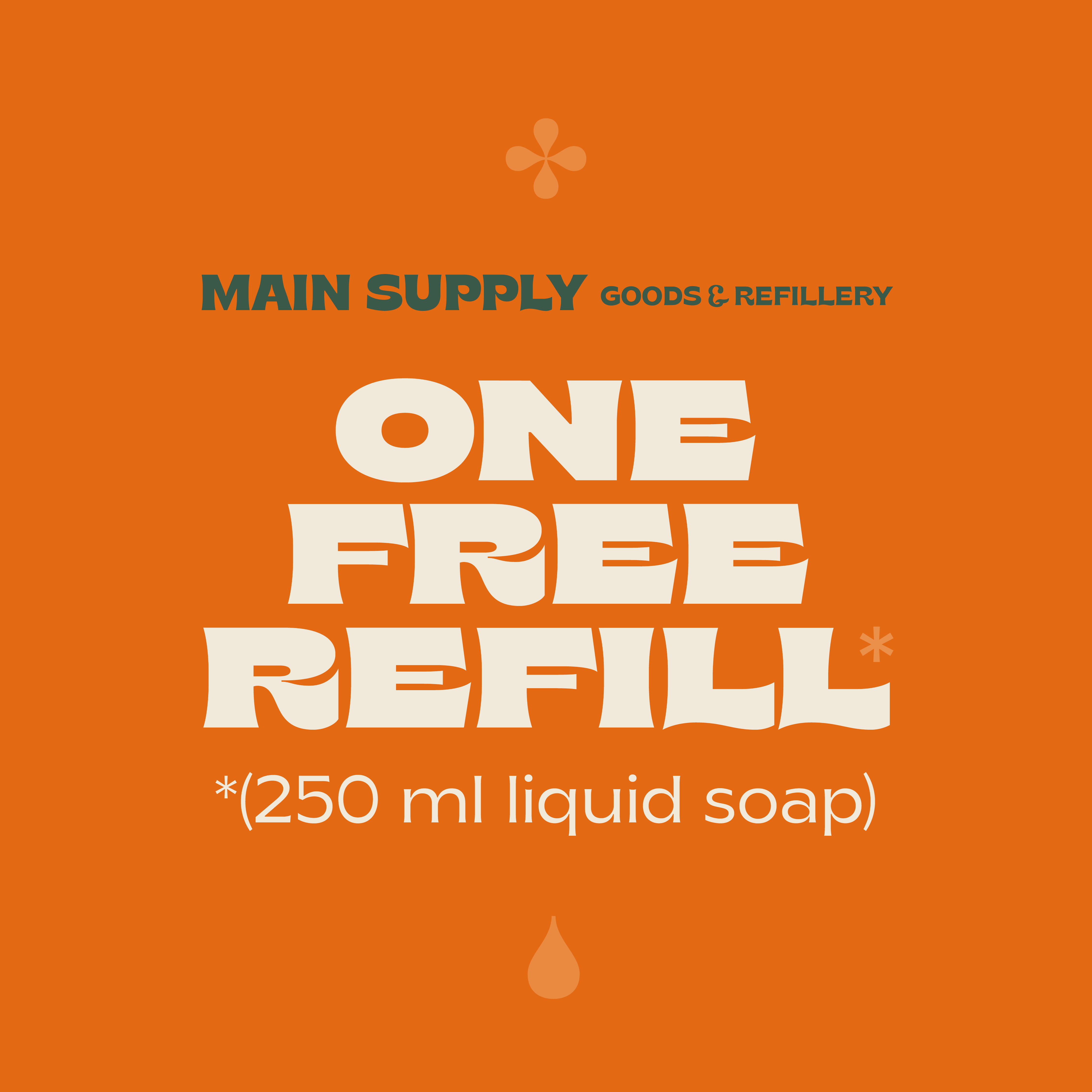
Below are some examples of the social media graphics and stationery that I created.


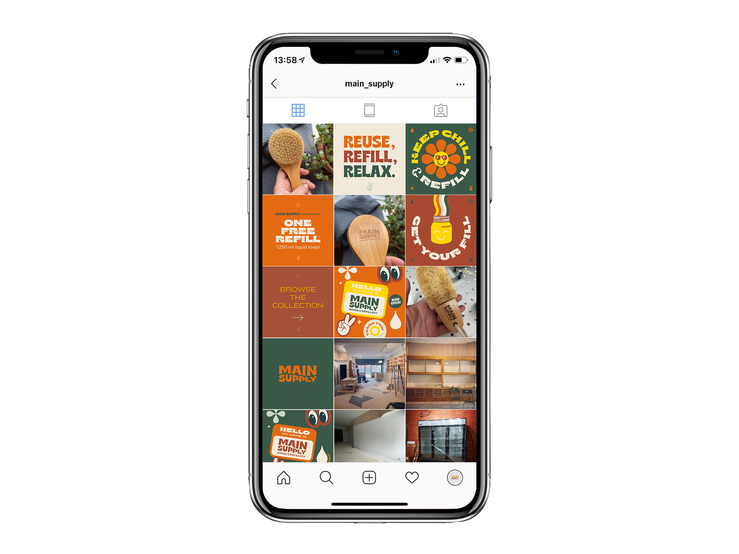
Social Media
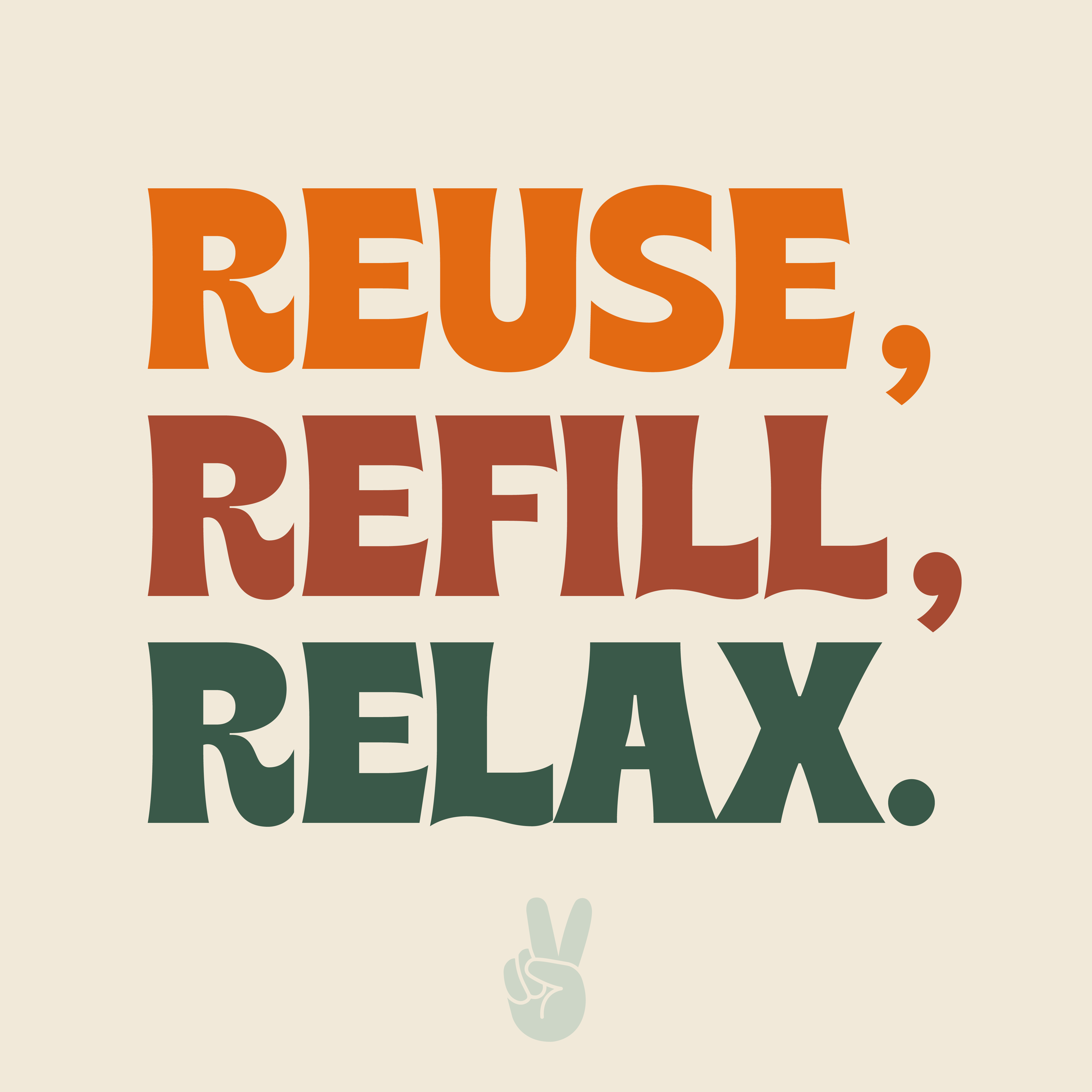
I created a suite of retro-tinged, fun-infused graphics and illustrations to use on social media to increase awareness and introduce the brand.