
myCambrian intranet
Cambrian College was migrating its existing intranet to Interact, a new platform built around a customizable, WordPress-like content management system.
As the designer for the new myCambrian experience, I was responsible for translating Cambrian’s existing information and services into a new interface while working within the platform’s pre-built templates, widgets and technical limitations.
The project involved research, user testing, information architecture, interface design and multiple rounds of iteration. Rather than simply recreating the existing intranet, the goal was to rethink how students, faculty and staff could find and interact with information across the system.
Client
Cambrian College
Disciplines
UX/UI Design, Information Architecture, User Research, Usability Testing, Brand & Content Strategy
Exploration
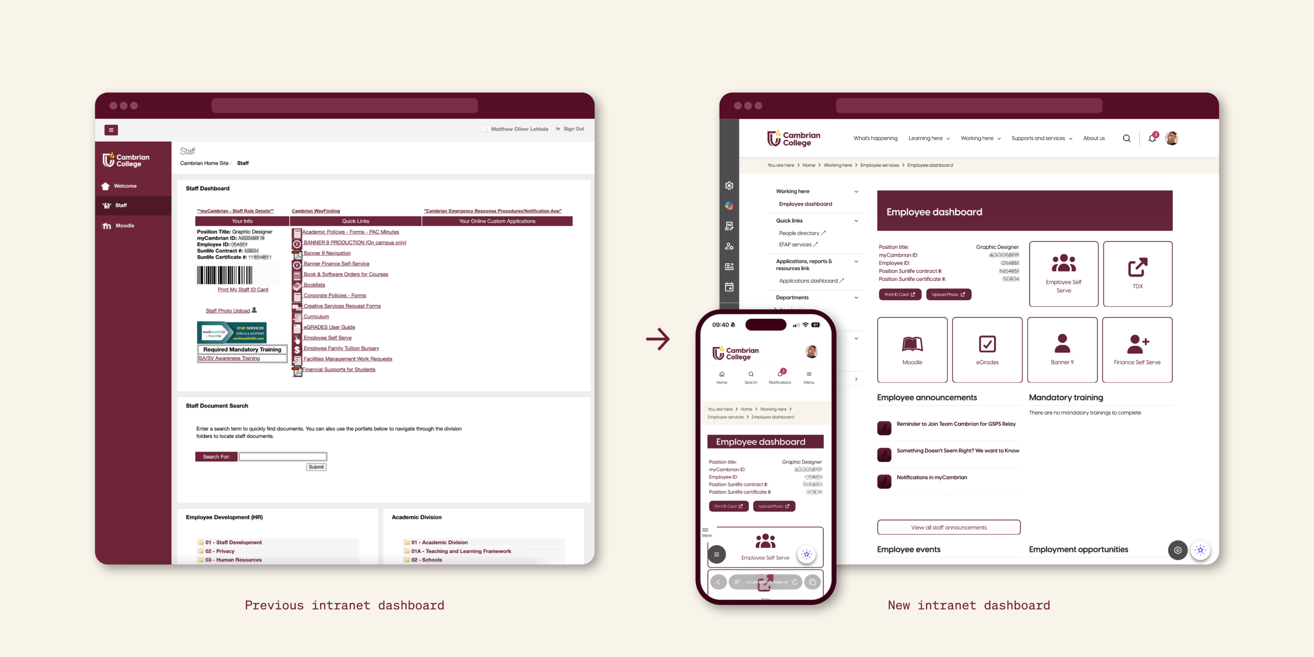
The previous intranet had become difficult to navigate, with information often presented as long, undifferentiated lists of links. Important services and resources competed for attention, making it difficult for users to understand where to begin or determine which information was relevant to them.
At the same time, the new Interact platform imposed significant design constraints. Its pre-built widgets and templates offered limited customization, meaning the solution could not rely on completely bespoke interface components.
The challenge was therefore twofold: create a clearer information architecture while designing within a rigid UI framework.
Pages needed to feel intuitive and purposeful without overwhelming users with information. Content also needed to be structured in a way that could accommodate the very different needs of students, faculty and staff.
Process
The new interface was developed through an iterative process of consultation, testing and refinement.
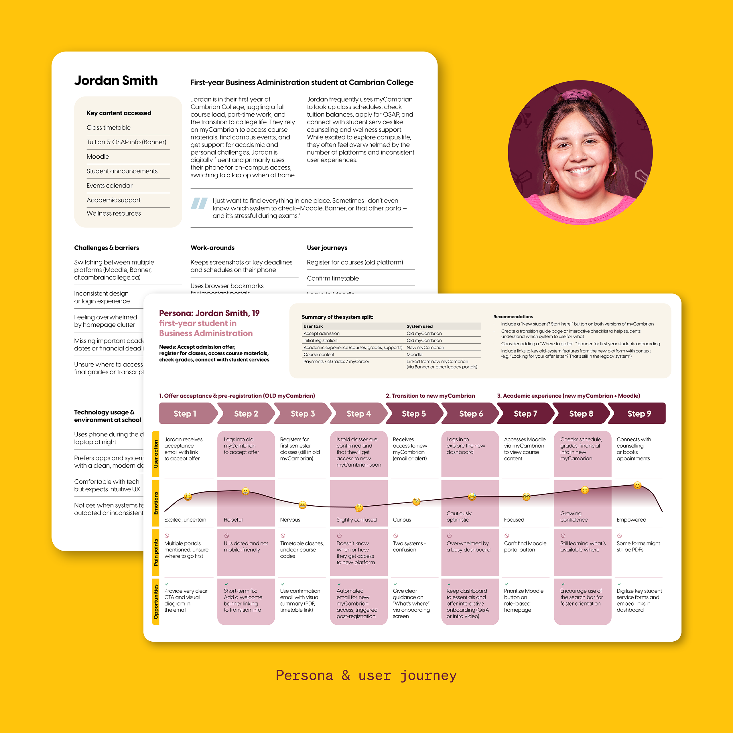
Staff, faculty and students who regularly used the intranet were consulted throughout the project, providing feedback on the organization and presentation of information.
Multiple rounds of testing and iteration explored questions such as:
- Which information should appear above the fold?
- Which actions and services should receive priority?
- How should frequently used portals be grouped?
- Where should buttons and calls to action be positioned?
- How much information should be presented on a landing page?
- How could different user groups quickly identify information relevant to them?
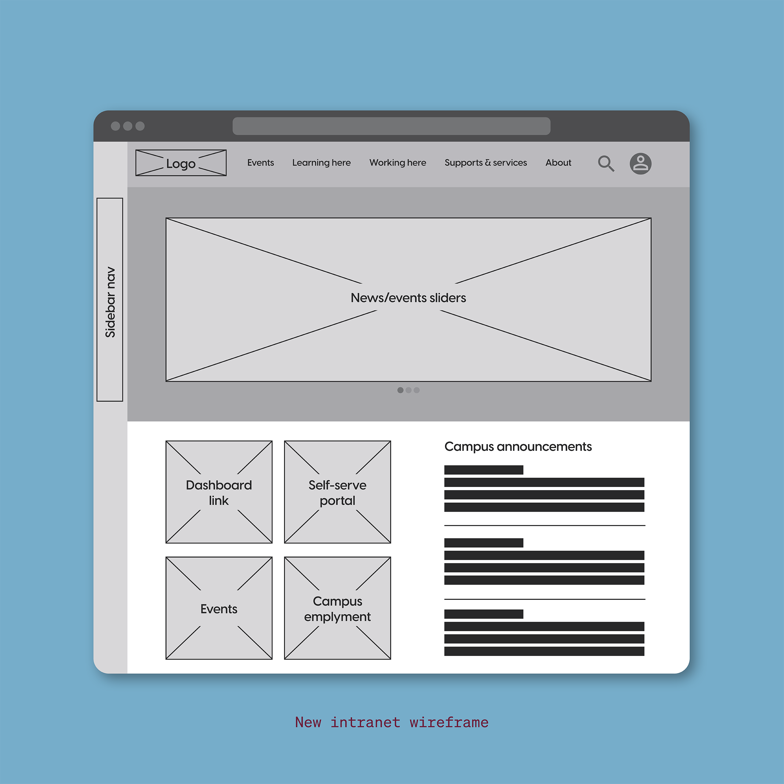
Early concepts were refined based on this feedback, with particular attention paid to information hierarchy, dashboard content, button placement, navigation and the balance between accessibility and information density.
Denouement – The Untagnling
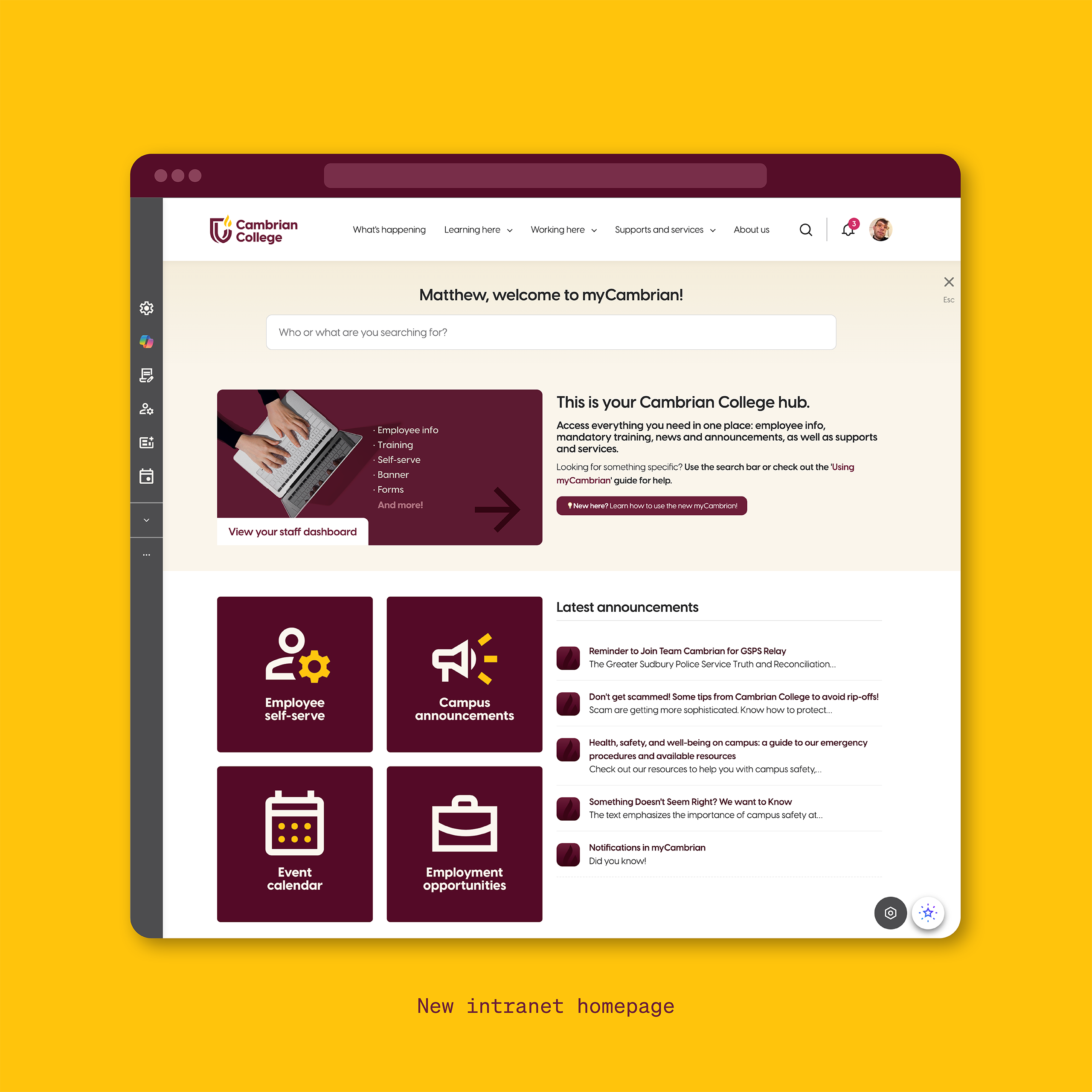
The solution began by recognizing that there wasn’t one single “Cambrian user.” Instead of presenting everyone with the same collection of portals and links, the intranet was organized around three primary audiences: Staff, Faculty and Students.
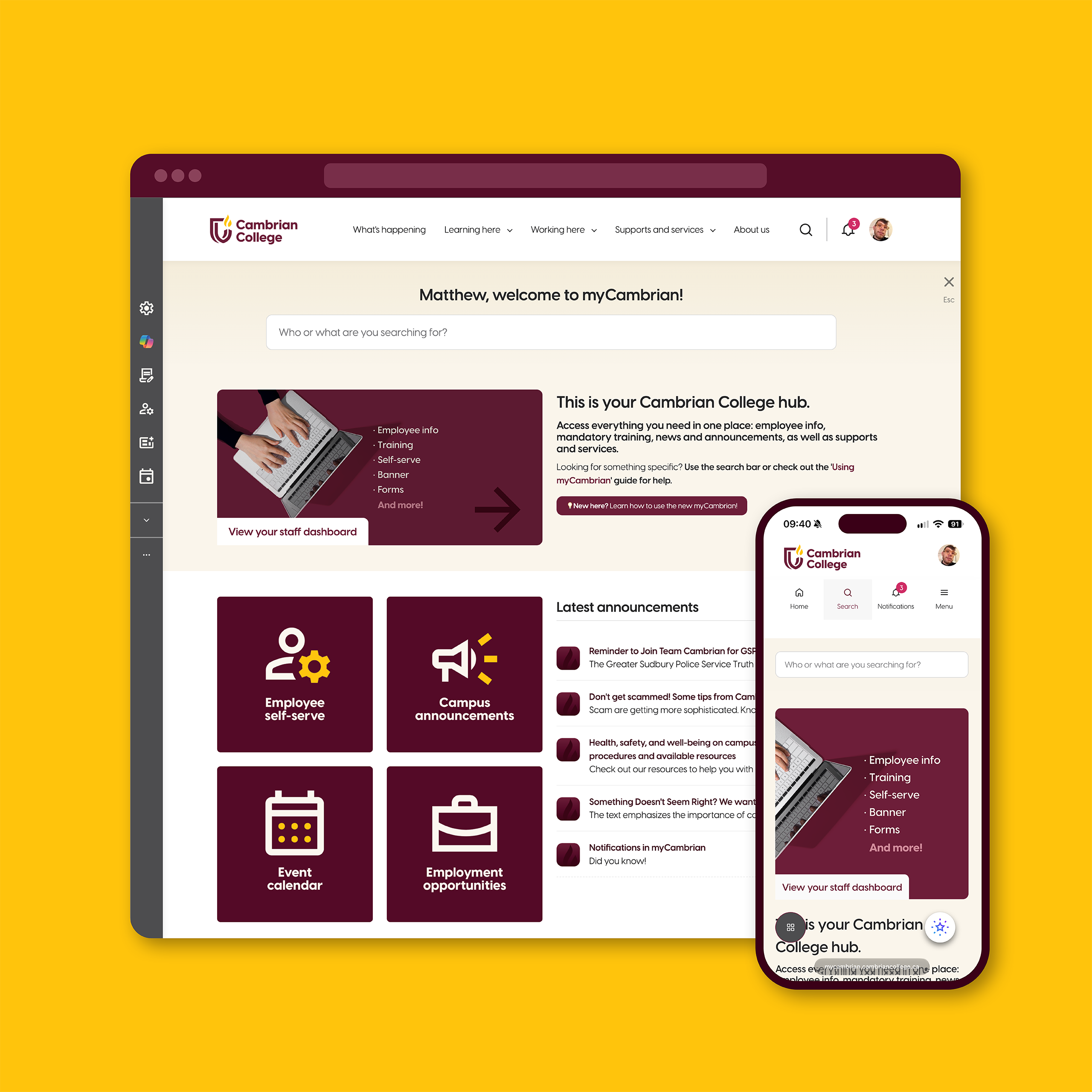
Each audience received a dedicated dashboard containing a curated selection of its most frequently accessed services and resources. Quick-link sections reduced the number of steps required to reach commonly used portals while allowing less frequently accessed information to remain available without competing for attention.
The nature of backend integration introduced another UX challenge: the people using the intranet (staff) were also responsible for maintaining it. Key staff users were therefore given the ability to modify their own landing pages, allowing departments to keep information current without relying entirely on a centralized web team. To prevent this flexibility from gradually creating an inconsistent or cluttered experience, I established guidance around content hierarchy and page structure. Staff could update their content while maintaining consistent rules for layout, particularly within the top portion of each page where users first encounter the information.
Results
The new myCambrian intranet replaced the previous link-heavy experience with a more structured and audience-focused interface.
Students, faculty and staff can now enter the intranet through dashboards designed around their specific needs, with frequently used services surfaced prominently and supporting information organized into clearer hierarchies.
The project demonstrated how thoughtful information architecture and user testing can improve an experience even when the underlying technology imposes significant design constraints.
Rather than attempting to fight the limitations of the Interact platform, the design worked within them—using the available components strategically to create an experience that feels intentional, coherent and easier to navigate.